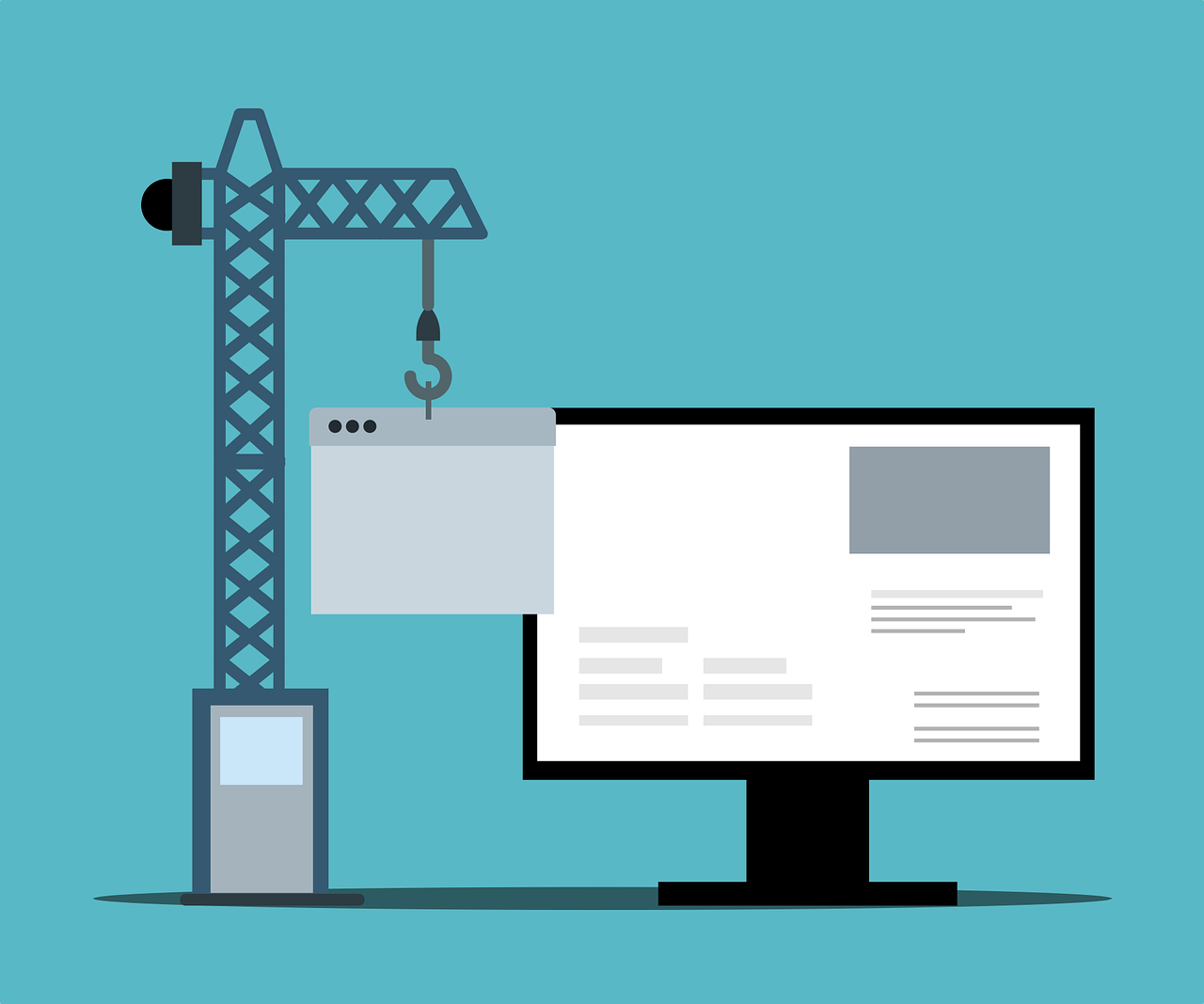
Landing pages are great, but they’re a useless part of your digital marketing campaigns if they don’t convert.
This guide outlines factors that will increase the conversions from a landing page for your B2B lead generation. Some you’ll know already - punchy header, engaging copy - but some of the juicier insights may be new to you.
What is a Lead Generation Landing Page?
A landing page is where a user arrives when clicking through from a search engine result page (SERP) to your site. Usually, arrival is restricted to one or a few specific channels: PPC ads, newsletter links, etc.
More specifically, a lead generation landing page is created with the goal of capturing a user’s attention and persuading them to complete the desired action.
The lead magnet - AKA the reason the user would share their details - can be anything, really. The most important part is to match the search intent with the offer.
Prospects near the top of the funnel can be offered webinar invitations, ebooks, and other knowledge-based resources, with the view to educate them about your brand and form positive associations.
Warmer prospects - or middle of the funnel leads - can be offered free trials, demos, consultations or similar tasters of your product or service.
Existing customers can be invited to move up to the next level of their subscription or to increase its length, or even exclusive access to events or launches.
Landing pages are exceptionally powerful. You have full control over the messaging on the page, you can be relatively certain of how the user found your page, and you can collect insights about engagement to increase the effectiveness of future campaigns. Lead generation landing pages are a vital part of any B2B lead generation campaign.
B2B Landing Pages vs B2C: What's The Difference?
Many commentators suggest that B2C landing pages should focus more on emotion, and let B2B landing pages focus on logic.
The argument being that riding on emotional coat-tails will be less effective in a B2B environment as buyers will have processes in place around their purchase. They will report to accounting departments, their managers, stakeholders, and so on.
This reasoning has its merits - but can be argued against. Using a subtle level of emotional appeal in a B2B campaign is the basis of content marketing. Remember, trust is an emotion, too. And what builds better rapport than trust?
The tips and insights in this guide are designed to be applicable to all industries, with the goal of helping you increase conversion rates using best practice guidelines.
What Are Good Lead Generating Landing Page Benchmarks?
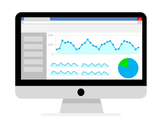
A cryptic statistic by Unbounce suggests that if you have a 12% conversion rate, you're doing better than about 90% of competitors. This isn’t the clearest answer, but it’s not a question that lends itself to one.
We suggest focussing on internal benchmarks with the view to improve these over time. A/B testing and effective reporting will give increasingly accurate internal engagement metrics, ideally leading to tweaks and refinements to increase it further.
Mailchimp gives a fantastic breakdown of various email metrics across industries which may provide a useful comparison of rates between industries, although remember they are two very different channels so the actual percentages are unlikely to marry up.
Gated versus Ungated Content: The Great Lead Gen Pages Debate
A gated landing page gives access to information or a resource in exchange for data. A visitor may provide their email address in exchange for an ebook, or their name, job title, and phone number in exchange for a trial version of some software. There is the implied understanding that the visitor will be contacted later in some marketing capacity.
Ungated pages provide as much useful knowledge as possible to prospective leads 'for free'. Prospects don't need to divulge their info in exchange for the asset. The intention of ungated landing pages is to have the prospect convert at a later stage, which makes ungated landing pages better suited to low-volume searches or top of the funnel intent.
Landing Pages versus Pillar Pages
A lead generation landing page traditionally has one, clearly defined purpose. They are gated, meaning that knowledge and insights must be earned. The aim is to convert visitors to the page and turn them into B2B leads. This is done by offering a resource in exchange for basic contact information.
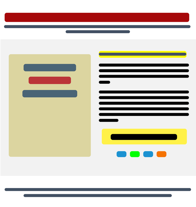
A pillar page, or content pillar, aims to be broad and provide as much knowledge as possible. It is designed to inform, educate, and build trust. Conversion is a less pressing priority: instead, seeds are sown to be cultivated later. They are much cooler leads, and will need some nurturing.
Trainline demonstrate pillar pages well. These pages list train times, which you'd expect, but they go one step further by offering a huge range of supplementary information about the journey, distance, average cost, operators, and more. This information fulfils secondary user intent and, if a user needs to book a ticket later, the chances of them remembering Trainline are higher.
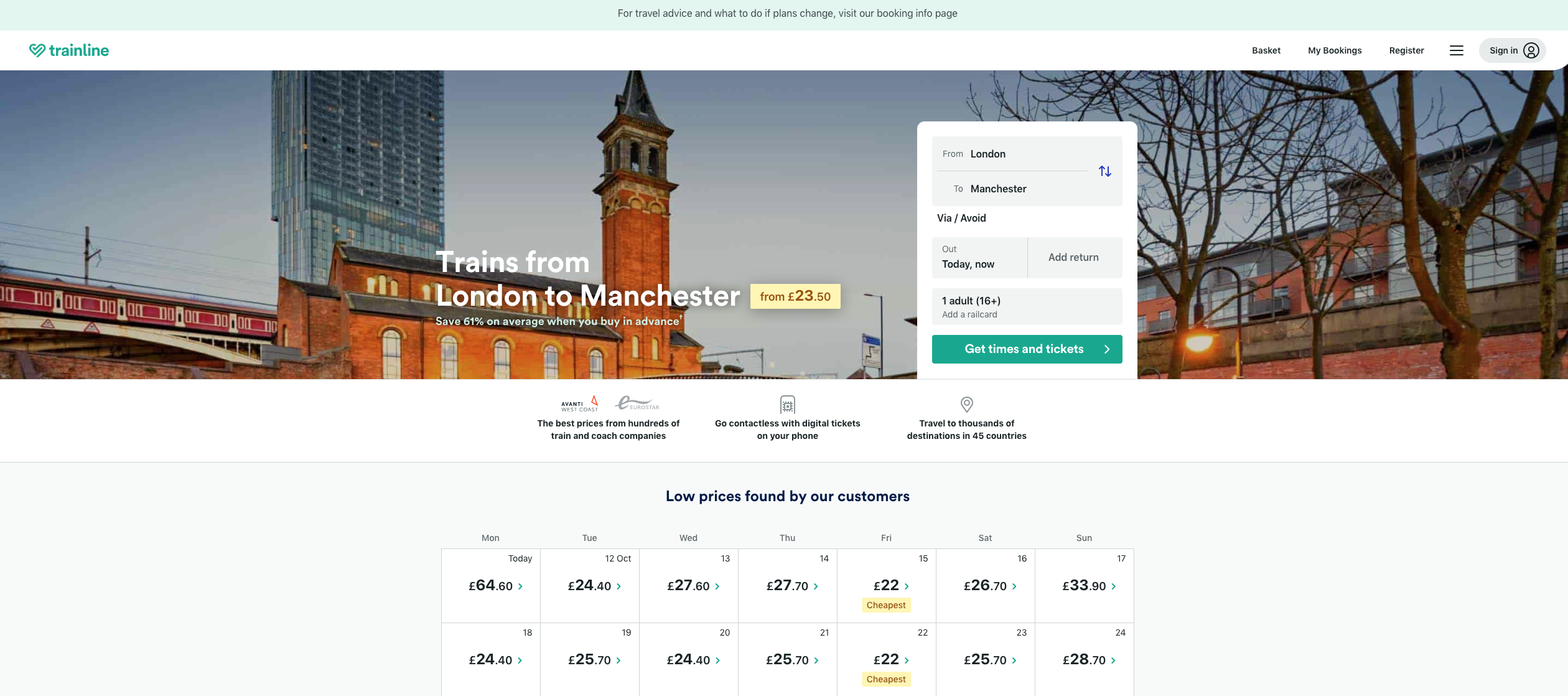
Image source: Trainline
Elements of TheBest B2B Landing Pages

When designing B2B lead generation landing pages, top-level considerations should be making the page effortless to navigate and engage with. Ensure there are as few distractions as possible.
As well as that you will want:
1. An impactful header, above the fold: This should immediately capture attention, and communicate benefits clearly. An anonymous marketing adage states that you have three words to capture someone's attention, so use impactful, action-oriented words at the start of your header. "Triple your conversion rate" is better than "This tool will help you to triple your conversion rate".
2. An unambiguous call to action (CTA): Visitors should know, consciously or subconsciously, what to do next. If using a button, make sure it stands out. Secondary or otherwise contrasting colours attract the eye better than theme colours.
There is no consensus on the 'right' number of CTAs, although it's generally agreed fewer are better. Many people advocate a maximum of two, with the theory being that any more than this dilutes attention and increases the risk of a visitor getting distracted and navigating away from the page. Those advocating for 2 or more suggest that CTAs can be pitched to different visitors: if someone doesn't want to convert via the main one, they may be tempted by a secondary, less committal one.
3. Concise, benefit-led copy: Imagine you're buying a new phone. "Do you want all your photos automatically backed up and protected in the cloud?" is punchier than "would you like a 2, 4, 8, 16 or 32GB SD card for file storage?". It conveys the benefit: knowing your photos are backed up and safe provides much more peace of mind than knowing you have a 32GB SD card.
In short: fewer, more relevant, more prominent words on your landing page will increase engagement.
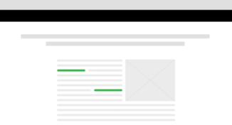
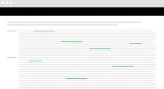
See below: would you be more likely to read through the digestible, engaging, easy paragraphs on the left - or the large blocks of text on the right?
(Images from Backlinko)
4. Targeted messaging: It is easier to convey product benefits if you have a tightly defined audience for your landing page. This should correspond to steps in the conversion funnel. Think about what they will want from the page, and design accordingly.
5. Social proof: Providing star ratings or a couple of short testimonials is a way to build trust quickly and concisely. Users are more likely to engage with a page if they know someone in their digital peer group has done the same.
6. An image: There is no hard or fast rule on whether images help with conversion rates: some suggest they do because they provide something visually interesting on the page, whereas others argue this is just a distraction from the CTA. A/B testing can probably help here...
7. Insights from A/B testing: Once the page is designed, use A/B testing to highlight choke points before making it live. Crowdsourcing opinions on the page, then comparing this with your sense checking is a great way to reach the optimal design.
There's a great story about landbot.io, whose landing page is a fullscreen chat window. This was originally done by accident, and goes against all of the folk wisdom about effective landing page design; however, they saw their conversions jump from 3% to 9.6%.
8. A CRO underpinning: CRO stands for Conversion Rate Optimisation. By removing unnecessary elements from forms on the page, you are less likely to lose a user’s attention. Some can be removed (fax), others consolidated ('name' instead of 'first name' and 'last name'). A user should be able to fill in forms as quickly and easily as possible.
B2B Landing Page Examples
To close, we leave you with a couple of the best B2B landing page examples we’ve seen recently:
Asana
We like the big, punchy heading. But our favourite aspect is the use of colour: the page is grayscale except for the blue CTA, which is a secondary of the orange in the Asana logo. There is only one field to fill in, too. Very concise!
HubSpot
Who can resist those six words? They almost perfectly capture what every business wants to do. The supplementary text is so small that your eye is drawn immediately to the CTAs after reading the headline: bold blue for the primary CTA, and a dull grey for the second one (the video is designed to provide further info to those not ready to sign up yet).
In conclusion...
When you get a landing page right, learn from it. Carry those insights forward into future campaigns. You will begin to see your conversion rate creep up as you collect experience (and leads!)
As with all marketing campaigns, centre your focus around the user. If you can successfully create a page that anticipates and meets their needs, you'll be unstoppable.
If you're ready to boost your lead generation, we're ready to make it happen. Book your free consultation with our digital marketing experts today and unlock your potential.


